Featured Image
UX Design

Color and Font Series

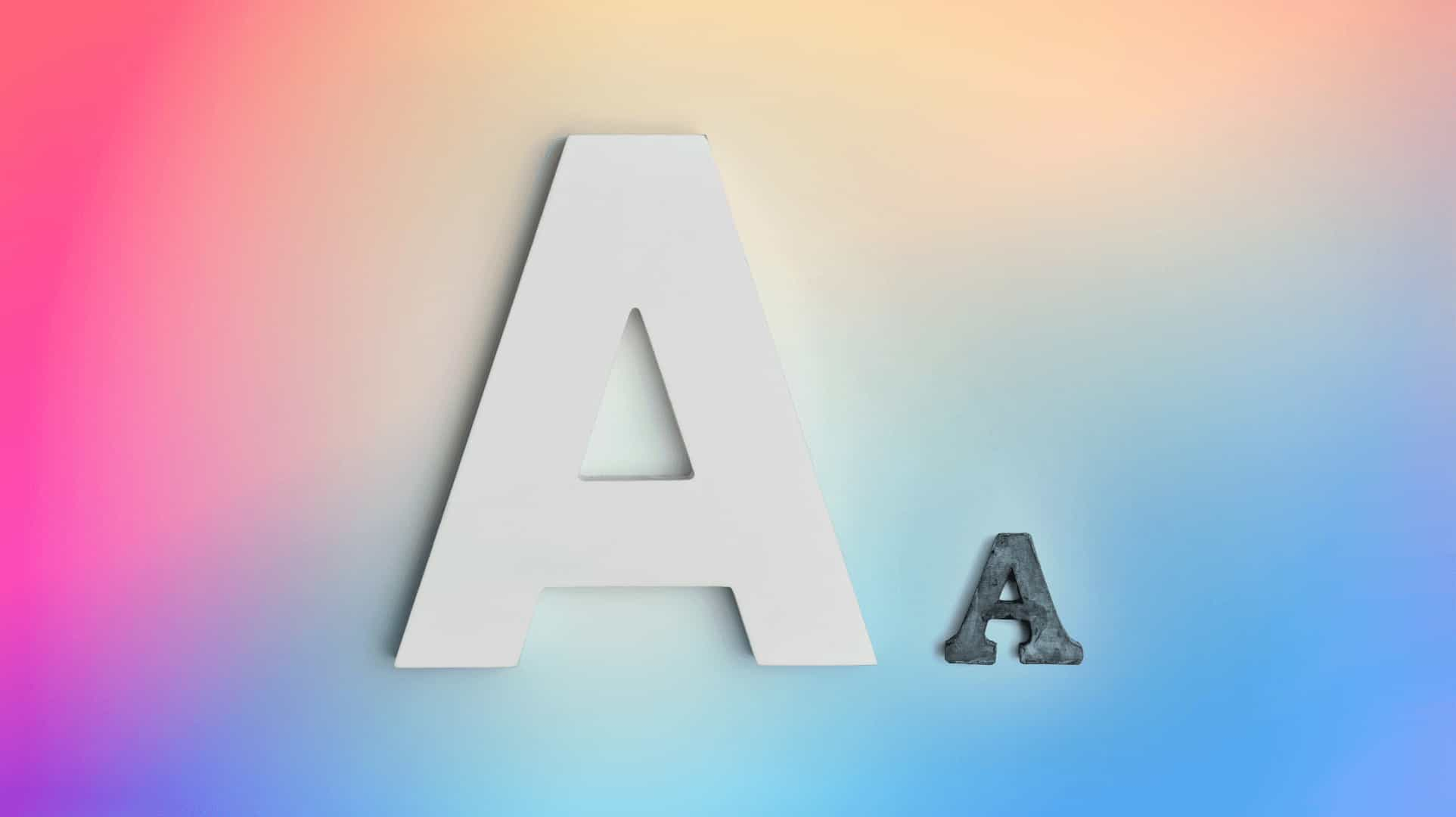
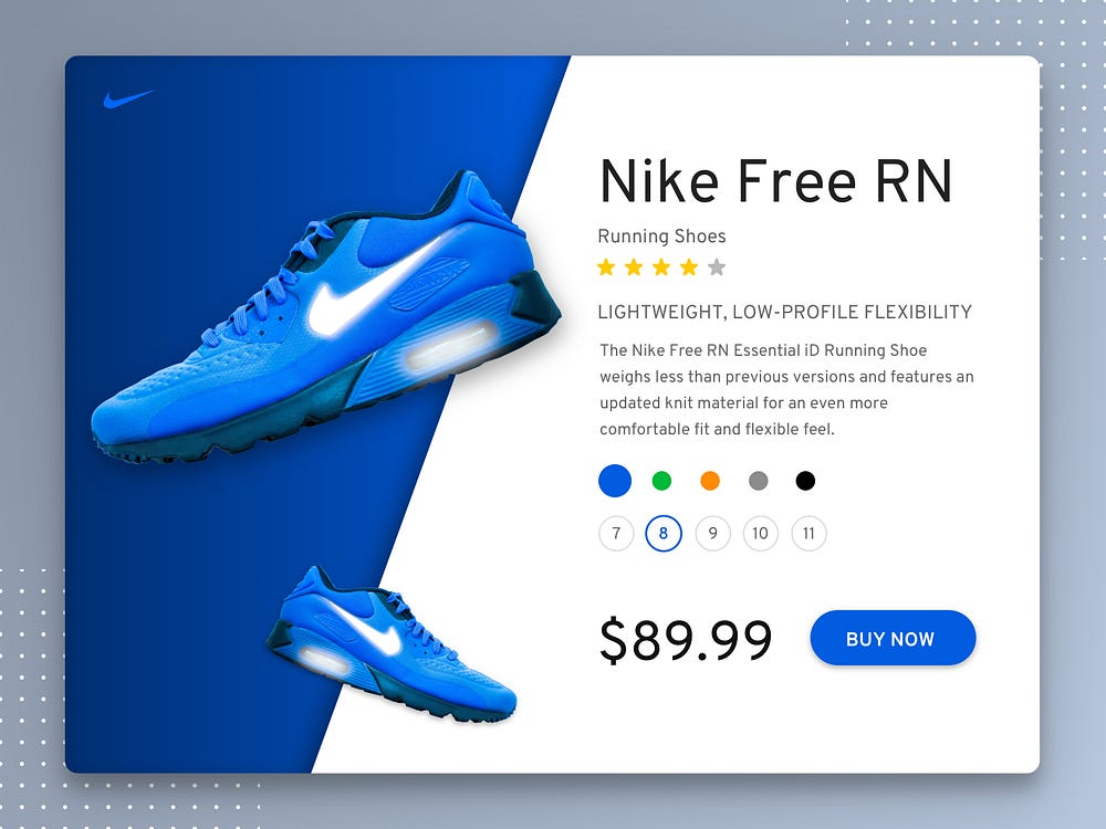
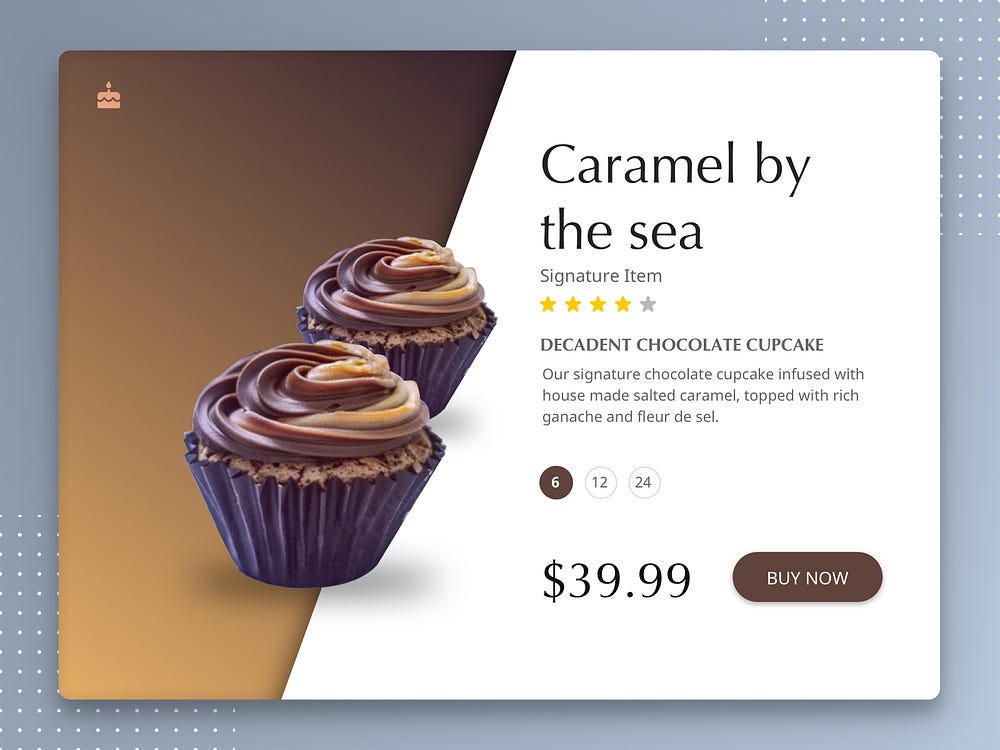
Ever wondered how colors and fonts impact your design? Since past few days, I am experimenting using different colors and fonts in the same layout. The goal of this exercise was to play with colors and fonts and defining the visual language – keeping the structure of the layout consistent.


I started this exercise by sketching a product page layout, picked 3 products that I wanted to use for various experiments, and chose typeface and color for each of them.

While practicing this, I asked myself a few questions:

  • What mood should be conveyed to the users?
  • How should they feel when they see the product page?
  • Is the color justifying the product?
  • Is the typeface aligning with the product?
  • Does the color and font carry enough contrast?
  • Do the color and font decisions go hand in hand?
  • Are visual decisions working well when put together?

As a result

I came up with three shots.

SHOT #1 | Product: Shoe

Product: Shoes

Color and Font Series #1

This was the first shot from the series and wanted to have a bold and cool image. So I chose a product from Nike. The content is structured with information relevant for the product. There will be option to choose color and size of the shoe.

Mood board

Knowledge
Power
Integrity
Seriousness

Color: Blue

Since the product is Blue, I decided to use the same color for background and action button.

Font: Overpass

Overpass font is good choice to show bold and sharp image of the brand.


Products: Cupcakes

Color and Font Series #2

In the second shot, I chose cupcakes. I have chosen a specific flavored cupcake. Since the product is a chocolate cupcake, I don’t think we need color options  . There will be an option to choose quantity of cupcakes.

Mood board

Warmth
Friendliness
Dependability
Wholesomeness

Color: Brown

I chose brown, because it is a warm and stimulates the appetite which goes perfectly for warmth conveying products like cupcakes. I have applied gradient to give spotlight the cupcakes.

Font: Optima

I found Optima on my system fonts. I tried them because the curves and straights of the fonts provide a graceful and clear impression to the eye.

Also read: 5 Lesser-Known Abilities Essential for Achieving Success as a UX Designer


Products: Earphones

Color and Font Series #3

In the third shot, I chose a product from Beats. This product is available in one size and there are no color options available, so there wasn’t a need for size and color picker.

Mood board

Freshness
Happiness
Clarity
Energy
Loyalty
Joy

Color: Yellow

Beats product is black and to highlight it, I have placed it on top of Yellow colored background. Subtle gradient is used to highlight the earphones. “Buy Now” font color is kept black to make it readable to the users.

Font: Comfortaa

This typeface matches the smooth and seamless design of the earphones.

Also read: Selecting the Perfect Typeface for Your Web Product’s Body Text


Things I learned

  • Colors and fonts play a huge role in a layout. It reinforces the feel that is conveyed by the product itself.
  • Colors stimulates the urge which may result in conversions.
    I have focused on Monochromatic colors in all three shots. Monochromatic color is based on one color with various tones and shades of it.
  • Every design has three primary levels of Type Hierarchy.
    1. Title: Defines product name on the layout
    2. Body Text: Defines descriptive text about the product.
    3. Headers (h1 to h6): Defines different layers of header styles. H1 is typically the biggest and most important, moving down through H6. You only need to use as many as you need in your design.
  • Characteristics of typefaces helps in binding the layout with the mood that I want to convey to the users. Here are a few of them which I referred from Eugene Sadko blog on Guide to 10 font characteristics and their use in designWeight affects the level of interpretation: from tender delicacy (Thin) to persistent rudeness (Black).
    Width affects message urgency: from a screaming headline (Extra Condensed) to long-awaited appearance above the horizon (Extra Expanded).
    Contrast levels the artistry of a message: from a speech synthesizer (Monoweight) to Grand Opera actress (Extra high contrast).
    Corner rounding influences over tenderness level: from sleeping babies (Rounding) to noisy teenagers (Sharpening).
    Serifs and Slabs create cultural context: from idealism of timeless classics (Serifs) to pragmatism of factory stamping (Slab serifs.)
  • It makes your design not only beautiful but it adds the magic of attraction to stand out the products.
  • I also realised the importance of content, to show only relevant information that the user might want to see according to the product.

Want to learn how I did it?

Here is an exercise that you can try.

  1. Think of a page that you want to design (keep in mind a hero element, for eg. Products in my case.)
  2. Sketch a layout of that page.
  3. Pick 2–3 different hero elements for various shots.
  4. Go to a Design Tool (I have used Sketch App) that you are most comfortable using and digitize your sketched layout.
  5. Keeping in mind the hero:(a) Decide the content (b) Pick a Color (c) Pick a Typeface
  6. You may also use special effects like Gradient, Shadows, etc. to highlight the hero.
  7. Voila! Now you’re ready to share the shot.

Hope you guys learnt something! So, what are you waiting for, go … make your own designs …… and don’t forget to share the link of your work!!!

Also read: 7 Strategies for Crafting an Efficient Search Feature for Digital Products

author
Jinisha Gajjar
I am UX Designer working with Aubergine Solutions. At Aubergine, we follow the design process to work on all projects. Here I have worked on Web and Mobile applications, B2B and B2C applications. I like to keep myself updated about the latest design trends, news, and tools. I have a good knack for a few design applications like Figma, Sketch, Axure, Illustrator, and InVision Studio.