

Digital products such as web and mobile applications have become the most popular way of information exchange with immense flexibility, dynamics, and power that they have to offer. But for a product to be consumable, efficient and successful, it not only demands the craftsmen be well versed with the respective domain but also demands to reflect the mental model of the users. This is where UX Design plays its role.
For already existing products or for products at its budding stage, our design department at aubergine solutions has a Design review to offer.It’s a check against the usability and efficiency of the product. It has the potential to identify the blocks in your product which are hindering a good user experience and essentially bringing down your business.
In this blog, I am sharing the aspects I prefer to consider for a Design review. This process which is non-linear in nature is inspired by the existing principles of Heuristic Evaluation and also includes inputs from my own studies, understanding and experience in the field of design. Without further ado, let’s delve into the aspects of a design review :
Allow me to walk you through the aspects and the rationale behind it.
Let’s meet granny.
I have used the word granny not in its literal sense but as a word to represent a set of target users for an application. Like any other process of design, a design review also starts with an understanding of users. We assume user personas and think of various scenarios they might come across during the journey of doing a task.
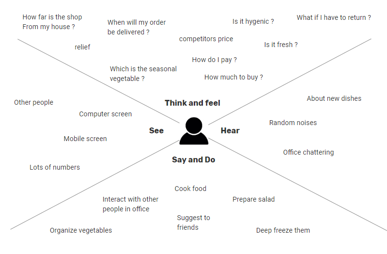
Let’s say there is an online platform for people to buy vegetables. Since each application would have a specific target audience, understanding them becomes the preliminary task because it is their needs and emotions that the application ideally targets to cater to.
How Tech savvy can granny be?
Can she really use an application?
how does she experience a traditional market space?
What expectations does she carry?
How does her previous learning affect her perception of the activity?
How does she interact with the shopkeeper when she visits in person?
and so on…
Age groups, sensory perception during engagement with the application, emotions, physical space, etc. are some of the many factors under scrutiny. They become the backbone for crafting an online world which attempts to replicate the original experience of buying vegetables and adding a layer of convenience over it. How do you make it closest or maybe better than the real experience for the user is a question that drives and decides the level of success of the user in accomplishing his/her goals and thereby contributes to crafting a good product. Hence, we find understanding User personas to be a very powerful practice and a major contributing thought process.
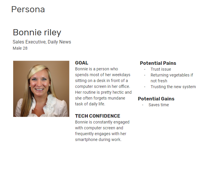
To illustrate the thought process we will take one of the possible personas and call the person Bonnie Riley. Following are first layer of assumptions made. This exercise lets us understand the user in a better way allowing us to judge or create a product which can trigger a positive emotional response. Often known as empathizing with the user.
This is just to illustrate the thought process. Detailed user research can be conducted during the induction of an application and we do not present it with the Design review, but the line of thoughts stay at heart when we perform a Design review.
Also read: Exploring Lean UX: A Comprehensive Guide to Process and Principles
Are you on a road that leads nowhere?
Information is everywhere. we navigate and interact in the world around us based on information our brain receives. These are subtle processes to which we don’t give much thought. We often react emotionally to it. E.g. You may get frustrated when you can’t find your vehicle keys. This is nothing but misplacement of information about the place of the key. It’s pretty annoying, right? Now imagine the hatred one might face when it’s not just a key but a complex chunk of information.
Before contacts became searchable on mobiles phones we used to have diaries which were indexed with alphabets so we can quickly access names starting with alphabets from A-Z. What if you just have an unorganized list of 100 contacts. How hard would it be to retrieve a specific contact from it? Pretty tough right?
How information is arranged, presented, and accessed affects our lives at an unimaginable level and it applies to web spaces as well. As we move ahead with technology the way we access information is dynamically changing. But there remain some fundamental rules for organizing information which will never change.
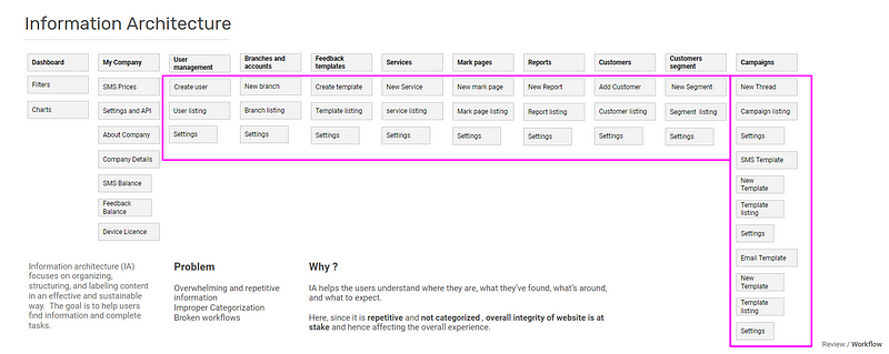
Information architecture or often known as IA can be considered as the backbone of good user experience and having it correct can pay off more than anything. It attempts to ensure the accessibility of information in the most efficient way. A good and strong base creates a strong and sturdy building for a long run.
A complex IA Detected in one of our design reviews
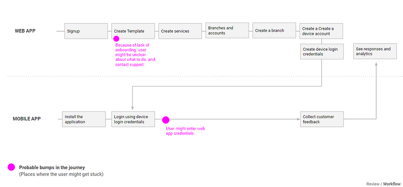
Now a set of well-organized information creates a flow or a procedure of steps that help the user accomplish a task. E.g How many steps do users have to perform to buy a product on an e-commerce website?. Observing how efficient are different flows in the application is the next thing to do considering time, efficiency and user satisfaction at heart.
Points creating confusion detected in a workflow
Also read: Discover 5 Overlooked Skills for UX Design Success
The blind spot
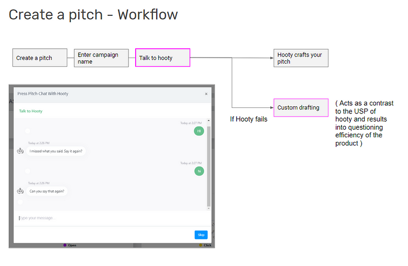
It has been often a case that being attracted by the latest trends and technology, the products adopt and overuse them leading to loss of efficiency. Both for the business as well as to the users which becomes like an unseen block only an external and trained design auditor can identify. These can even be core features and workflows and the way they are executed. I’ll let this be supported by a recent scenario we identified for Hooty.
Hooty is an AI-enabled platform which lets the user create their pitch for multiple types of personal/business needs. It has an ecosystem to distribute the pitch across a huge database of journalists. The block here was identified in the way the system acquires data from the user in order to generate the pitch.
The chat bot failed to understand the user at various levels and hence couldn’t auto-generate the pitch which is the core feature. The feature of a chat bot which asked data from the users was acting as a block and needs to be given a thought.
Likewise we love to study ecosystems and have a sharp eye for detecting error points.
What makes a cop, a cop?
Web space too is like any other real space with its own constraints. So, the way we interpret elements in web or real space stays the same. Let me illustrate with a simple example.
What makes a cop? is it the hat? The color of the uniform? Is it the badge? is it the gun? Maybe all of it.
The way we identify an element is via certain values associated with the element within our mind. These values are what gives the element an identity, uniqueness and also might trigger emotional responses within us. For each element, concept or any representational forms, there is a complex process of semiosis that works at an abstract level. Understanding the unique values of an idea and to make sure they are reflected by the web application becomes necessary in order to invoke the desired kind of response from the user.
For web applications, it is a check against how efficiently elements, features, and language of the application all-together reflect the concept of the application and if or if not it invokes an expected response from the user. E.g. A answer bot application such as Jane.ai has a bot upfront on their website. This is a risky decision as the bot might under perform but also something which can generate positive results by presenting the power of the product upfront. This is a concept communication decision.
A well-depicted concept might not be appreciated upfront as it works on a subtle level. Every time you see a cop you do not have to consciously provide yourself the rationale that he is a cop because he is wearing a cop uniform. You just accept it as your mind is trained to do so. But bear in mind that you might never identify a cop without his uniform. Hence concept communication becomes a subtle art necessary for positive identification and uniqueness of the web application.
Bricks that make a building
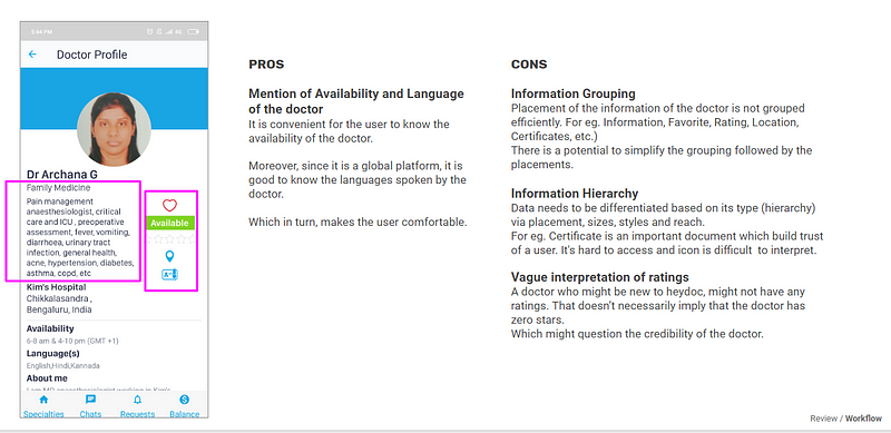
In this examination, various forms are Identified which are visual in nature including the use of type and various elements of the User Interface. This extensive study goes through each/key screens of the product. Following is an example of a slide from one of the audits we performed for HeyDoc mobile app.
Highlighting UI elements with its pros and cons
Summarizing the review
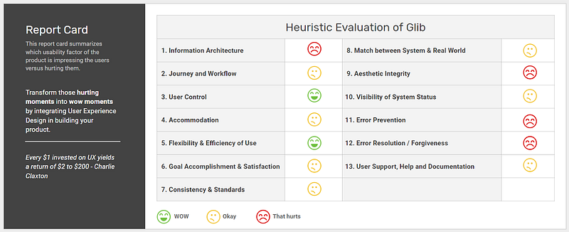
The Design review ends with a report card reflecting the current state of the application and the potential areas of improvement. The criteria of the report are universal standards and are selected from well-known principles of heuristic evaluation.
Via these Design reviews, we have helped various products identify blocks hindering good user experience. Some of them are our happiest customers now. If you are engaged with a digital product and haven’t had a touch of UX Design yet, its time you ask ‘is your product good for granny?’
Also read: The Importance of a Usability Review for Your Product
Do you have a product? What’s your approach to usability review? Worried about the cost of rigorous user testing? Well, a Usability Review achieves the same purpose for free. Get a FREE Usability Review done here.
To learn more about our specialized UX design services, get in touch with us today.