


Language is a way to communicate our thoughts in a better way. Similarly, there exists a design system language of some kind in the frontend world. It helps users identify what it is and what to do next. Overall it improves the User experience to a great extent.
Talking about more specific to the mobile world, There are main two types of design systems.
You are free to implement the Material design for all your apps targetting Android, iOS, and the web. It will give a consistent user experience across all devices and browsers. But if you have got more time or you want your iOS users to feel at home by providing an iOS-style design to the app (Just like WhatsApp), you would need the Cupertino widgets library to do that. Flutter has already got you covered for this. You can see the list of all Cupertino widgets here.
As Flutter is becoming the fastest growing toolkit to develop apps, the demand for having more Cupertino widgets increased. With the release of Flutter 2.0, the team has launched some new Cupertino widgets.
In this tutorial, we will cover the below new Cupertino widgets in Flutter.
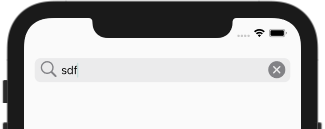
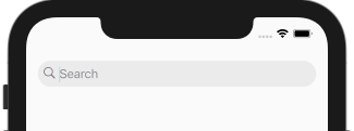
CupertinoSearchTextField is a widget that allows a user to enter the search term. It is consist of TextField, Search Icon and Cancel button. CupertinoSearchTextField does not perform the search itself but allows us a way to get the search term and process it further.
Below is the minimal code to show CupertinoSearchTextField.
import 'package:flutter/cupertino.dart';
import 'package:flutter/material.dart';

class CupertionSearchWidget extends StatelessWidget {
  @override
  Widget build(BuildContext context) {
    return Scaffold(
        body: SafeArea(
        child: Container(
          padding: EdgeInsets.all(16),
          child: CupertinoSearchTextField(),
        ),
    ));
  }
}
And it looks like this…
Let’s look at some properties to customize the CupertinoSearchTextField.
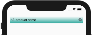
Changing the background
CupertinoSearchTextField(
  backgroundColor: Colors.orange,
)

CupertinoSearchTextField(
  decoration: BoxDecoration(
    gradient: LinearGradient(
      begin: FractionalOffset.topCenter,
      end: FractionalOffset.bottomCenter,
      colors: [
        Colors.teal.withOpacity(0.0),
        Colors.teal.withOpacity(0.8),
      ],
    ),
  ),
)
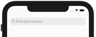
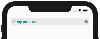
Changing the placeholder and its style
CupertinoSearchTextField(
  placeholder: 'Find your product',
)
CupertinoSearchTextField(
  backgroundColor: Colors.orange,
  placeholderStyle: TextStyle(color: Colors.white.withOpacity(0.8)),
)

Changing the style for search text
CupertinoSearchTextField(
  style: TextStyle(color: Colors.teal, fontWeight: FontWeight.bold),
)
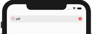
Modifying search and cancel icon
CupertinoSearchTextField(
  itemSize: 30,
)
CupertinoSearchTextField(
  itemColor: Colors.red,
)
CupertinoSearchTextField(
  suffixIcon: Icon(Icons.cancel_presentation),
)
Making the rounded corner search box
CupertinoSearchTextField(
  borderRadius: BorderRadius.all(Radius.circular(20)),
)
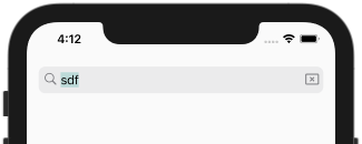
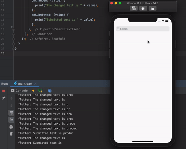
Receiving input text
The input text can be received via onChanged and onSubmit callback.
CupertinoSearchTextField(
  onChanged: (value) {
    print("The changed text is " + value);
  },
  onSubmitted: (value) {
    print("Submitted text is " + value);
  },
)
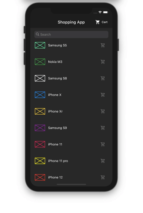
Let’s try to build a working example
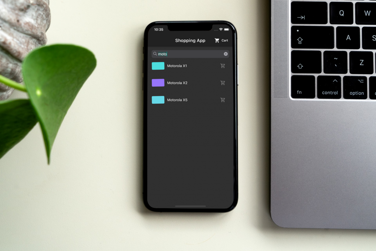
Our goal is to filter the list of products as the user enters the product name inside the CupertinoSearchTextField. Also, the user should be able to see the full list with the click of the cancel icon.
Step 1: Creating a list of products.
const List<Product> products = const <Product>[
  const Product('Samsung S5', Colors.greenAccent),
  const Product('Nokia M3', Colors.green),
  const Product('Samsung S8', Colors.white),
  const Product('iPhone X', Colors.blue),
  const Product('iPhone Xr', Colors.amberAccent),
  const Product('Samsung S9', Colors.purple),
  const Product('iPhone 11', Colors.pink),
  const Product('iPhone 11 pro', Colors.yellowAccent),
  const Product('iPhone 12', Colors.red),
  const Product('iPhone 12 mini', Colors.blueAccent),
  const Product('Nokia M2', Colors.deepOrange),
  const Product('iPhone 11 pro max', Colors.cyan),
  const Product('Motorola X1', Colors.lightBlue),
  const Product('Motorola X2', Colors.deepPurpleAccent),
  const Product('Motorola X5', Colors.indigoAccent),
];
Step 2: Copy all products into the filteredProducts. filteredProducts is just another variable to show a filtered product list.
List<Product> _filteredProducts = products;
Step 3: Use the filteredProducts to display a list of products in any kind of list view.
GridView.builder(
  itemCount: _filteredProducts.length,
  itemBuilder: (context, index) =>
      ProductTile(_filteredProducts[index]),
  gridDelegate: SliverGridDelegateWithFixedCrossAxisCount(
    crossAxisCount: constraints.maxWidth > 700 ? 4 : 1,
    childAspectRatio: 5,
  ),
);
Step 4: Place a CupertinoSearchTextField as shown in the below code above list of products inside the widget tree.
CupertinoSearchTextField(
  controller: _controller,
  style: TextStyle(color: Colors.white),
  onChanged: (value) {
    _updateProductList(value);
  },
  onSubmitted: (value) {
    _updateProductList(value);
  },
  onSuffixTap: () {
    _updateProductList('');
  },
)
Step 5: Implementing _updateProductList() method to find the product that matches with the search term.
void _updateProductList(String value) {

  if (value.length > 0) {
    _filteredProducts = _filteredProducts
        .where((element) =>
            element.name.toLowerCase().contains(value.toLowerCase()))
        .toList();
  } else {
    _controller.text = '';
    _filteredProducts = products;
  }

  setState(() {});
}
And here is the output.
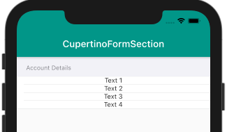
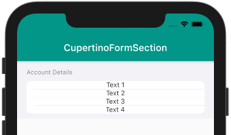
CupertinoFormSection is a widget that creates a standard iOS form.
The basic code to show CupertinoFormSection looks like this.
CupertinoFormSection(
  header: Text('Account Details'),
  children: [
    Text('Text 1'),
    Text('Text 2'),
    Text('Text 3'),
    Text('Text 4')
  ],
)
Output:
You can also create standard “Inset Grouped” iOS forms using CupertinoFormSection.insetGrouped constructor. This creates a rounded shaped form.
CupertinoFormSection.insetGrouped(
  header: Text('Account Details'),
  children: [
    Text('Text 1'),
    Text('Text 2'),
    Text('Text 3'),
    Text('Text 4')
  ],
)
Output:
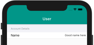
CupertinoFormRow is a widget used to create an iOS style form row that consists of prefix and child widget.
The sample code looks like this
CupertinoFormSection(
  header: Text('Account Details'),
  children: [
    CupertinoFormRow(
      prefix: Text('Name'),
      child: Text('Good name here'),
    ),
  ],
)
Output:
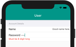
It has also got the error widget which can be very helpful in showing validation errors when you have any input widget in the child property. The basic example is entering a password.
CupertinoFormRow(
  child: CupertinoTextField(
    obscureText: true,
  ),
  prefix: Text("Password"),
  error: Text('Must be 8 digit long'),
)
Output:
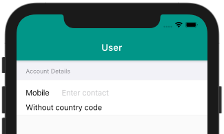
CupertinoTextFormFieldRow is a combination of three widgets.
At its heart, it’s just a CupertinoTextField with CupertinoFormRow and FormField wrapped over it. Here is how to use it.
CupertinoFormRow(
  prefix: Text('Mobile'),
  child: CupertinoTextFormFieldRow(
    placeholder: "Enter contact",
    keyboardType: TextInputType.phone,
  ),
  helper: Text('Without country code'),
)
Output:
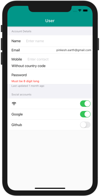
Hers is the code to build a complete form using CupertinoFormSection, CupertinoFormRow, and CupertinoTextFormFieldRow.
SingleChildScrollView(
  child: Column(
    crossAxisAlignment: CrossAxisAlignment.start,
    children: [
      CupertinoFormSection(
        header: Text('Account Details'),
        children: [
          CupertinoFormRow(
            prefix: Text('Name'),
            child: CupertinoTextFormFieldRow(
              placeholder: "Enter name",
            ),
          ),
          CupertinoFormRow(
            prefix: Text("Email"),
            child: Text('pinkesh.earth@gmail.com'),
          ),
          CupertinoFormRow(
            prefix: Text('Mobile'),
            child: CupertinoTextFormFieldRow(
              placeholder: "Enter contact",
              keyboardType: TextInputType.phone,
            ),
            helper: Text('Without country code'),
          ),
          CupertinoFormRow(
            child: CupertinoTextFormFieldRow(
              obscureText: true,
            ),
            prefix: Text("Password"),
            error: Text('Must be 8 digit long'),
          ),
        ],
        footer: Text('Last updated 1 month ago'),
      ),
      CupertinoFormSection(
        header: Text('Social accounts'),
        children: [
          CupertinoFormRow(
            prefix: Icon(Icons.wifi),
            child: CupertinoSwitch(
              value: true,
              onChanged: (value) {},
            ),
          ),
          CupertinoFormRow(
            prefix: Text('Google'),
            child: CupertinoSwitch(
              value: true,
              onChanged: (value) {},
            ),
          ),
          CupertinoFormRow(
            prefix: Text("Github"),
            child: CupertinoSwitch(
              value: false,
              onChanged: (value) {},
            ),
          ),
        ],
      )
    ],
  ),
)
Output:
In this tutorial, we learned some new Cupertino widgets and saw how to customize them as per our needs. If you enjoyed reading this blog post, we recommend checking out our blog on creating an onboarding page indicator in Flutter within 3 minutes.

