


There are many sites in the present date that provide house rental services. Customers can rent a place from owners directly from the website. The challenge for such companies is to decide the perfect price for a place. These companies use ML to predict the price of place based on the information provided.
In this notebook, we will try to replicate the model used by these websites and understand the data science techniques used. We’ll use Melbourne house prices dataset from kaggle.
Predict the price of rental places based on other information like the number of rooms, landsize, area, etc.
No matter what the problem is, but data science has the same framework to follow for every problem. These are the steps to follow for solving the problem from the higher viewpoint:
We will need to use some python packages for playing with data, visualizations and creating models. The following packages will be enough for our case.
EDA stands for Exploratory Data Analysis, i.e. analysis of data giving us some insights into how data is structured. This step is most important as we have just started to understand the data at hand.
Data cleaning comes after having insights on data.
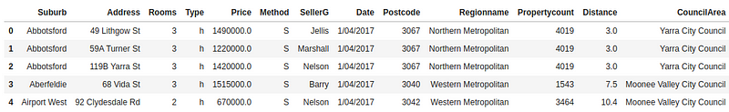
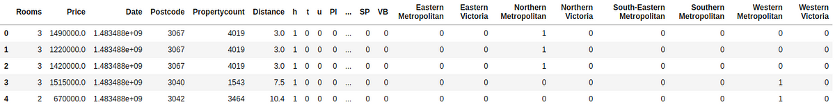
Now, let’s look into imported data. Our data contains the following columns:
1. Suburb
2. Address
3. Rooms
4. Type
5. Price
6. Method
7. SellerG
8. Date
9. Postcode
10. Regionname
11. Propertycount
12. Distance
13. CouncilArea
Most of these columns are string with no effect on the price of the house. So, our first step will be to remove such fields and convert categorical fields into numeric fields.
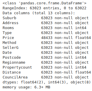
We can check metadata regarding different columns of the DataFrame using .info() method.
https://gist.github.com/vivekpadia70/ada32e81720afed017fa2f8416f0c700
Use .describe() for getting different statistical values of numerical fields. These statistical values are important for cleaning purposes.
Outliers
In our data, there are some values higher than others. These values affect statistical values and create bias. These are called outliers. The best practice is to remove such outliers before the training model.
We can use .describe() for finding outliers. First, see the mean of DataFrame which is an average value from the whole dataset. Percentile values lets us find the threshold for removing outliers.
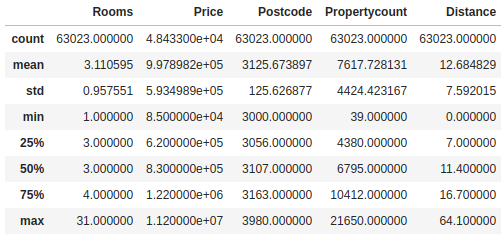
From data, it is clear that the difference between the maximum value and 75th percentile is high and there should be some outliers. Let’s check this using box plot.
Boxplot
Boxplot used for looking statistical data and outliers of data. It is more easy to understand compared to the Violin plot.
Box in graph represents the following statistics in visual:
1. Minimum of data
2. 25th Percentile
3. Mean
4. 75th Percentile
5. Maximum of data
6. Dots above that line are Outliers(Having values 3 times more than the interquartile range)
For more information, take a look at this.
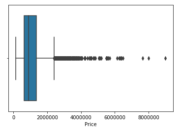
We remove outliers that are priced above 2500000 and again plotting the data on the box plot.
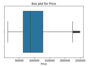
Graph without outliers looks more appealing than one with outliers.
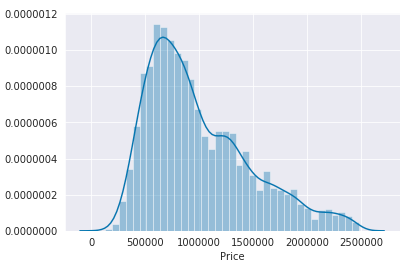
EDA is not complete without visualizations. As compared to statistical values, plots give a lot more information and show us patterns in data.
Visualization is a great tool before the Feature Engineering step.
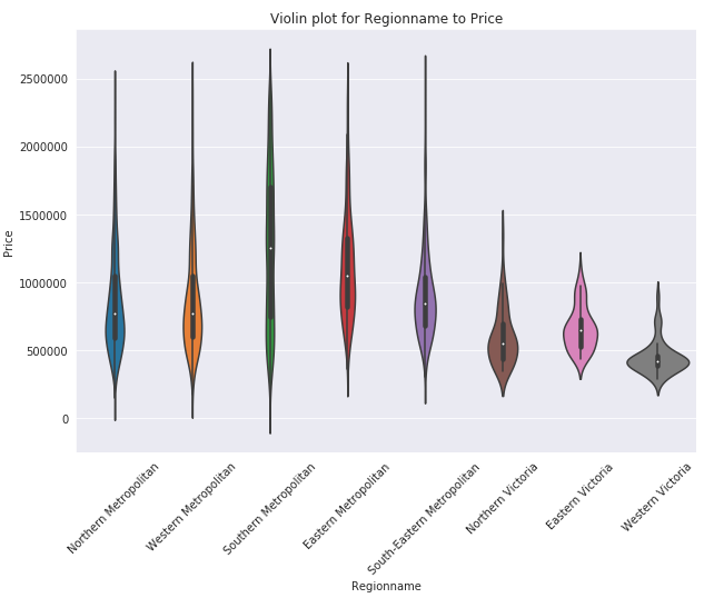
The violin plot is used for checking the statistics of data visually. It is also helpful at identifying outliers more precisely compared to numerical values. EDA is not complete unless some information is retrieved from the visualizations.
Below plot is giving following insights for the data:
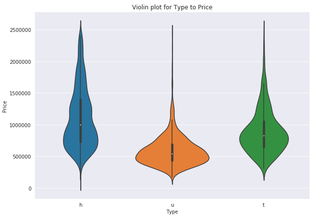
Again checking the violin plot with Type of room against Price. Same as Regionname graph, h Type is most expensive following t Type and then u Type of rooms.
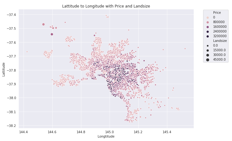
Our data is related to the city, so we can plot the city based on the Lattitude and Longitude provided in the dataset. These plots give more ideas related to which area of the city is more expensive in terms of visuals.
In the below graph, dark dots are Priced higher than light dots. The size of the dot represents the Landsize. The center of city has expensive places than others.
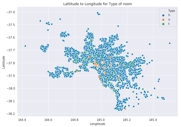
Most of the rooms have Type h in the whole city and other Types are also distributed across the data.
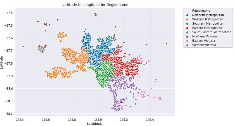
The below graph is showing all the region names of data visually. Southern Metropolitan is in the center of the city. Comparing this plot with the first plot says that Southern Metropolitan has the most expensive places in the whole city. This information was also provided by the violin plot.
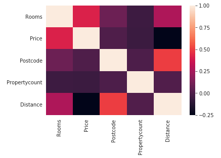
Heat map is checking the correlation between features of the data frame. This helps us find out which of the fields are dependent on each other and this dependence could be used in feature selection.
The process of Feature Engineering is important for the high accuracy of the prediction model. Good features increase the probability of high accuracy but bad features could also create load on the machine and decrease accuracy. Selected features should be related to the label of the dataset. More relation with data means high accuracy.
Further, feature engineering includes converting data into a more computation friendly format. Categorical data is converted into numerical form, dates are converted into a timestamp, string features should be removed and strings should be converted to numbers.
After the features are generated, the dataset should split into train-test datasets with the 80/20 ratio. Splitting is helpful in evaluating the performance of the model. We can’t test the model on train data because the model has already worked with that data. But test data could be considered as real-world data for model and its accuracy could be considered more reliable than train data scores.
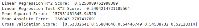
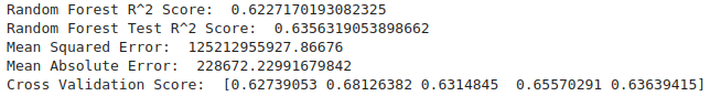
Modeling is the part where all the above sections will be used and the quality of data will be tested. Our problem is for Regressor models and we are using regressors from scikit-learn for prediction. Training data is used for training the model and testing data could be used for testing the model. For finding the optimal model, we’ll train multiple models and find their train-test accuracy and then select the best performing model. We are using the following models:
Models have parameters that affect the way the model approaches data. All the algorithms have multiple types of parameters suitable for different types of data. Better tuning increases accuracy and vice-versa. There are functions like GridSearchCV for finding optimal hyperparameters. GridSearchCV required a grid of parameters to iterate the model with and returning the highest accuracy parameters in output. You need to be careful while tuning hyperparameters as this can lead to overfitting or underfitting.
Overfitting
Overfitting means the model is closely trained on training data and will fail when predicting real data. This problem could be ignored if the model is not tested carefully. In solution for this, the model must be evaluated with testing data.
Underfitting
Underfitting means the model is not giving any accuracy on both datasets.
There are multiple parameters for evaluating our model based on the label of the dataset. Categorical labels have different ways of evaluation whereas Regression has different evaluations. Following methods are used for evaluation with Regression:
We are using some of these techniques for evaluation with train-test datasets.
Cross-validation is part of the evaluation. It divides data into multiple chunks and then tests the model on these data chunks randomly.
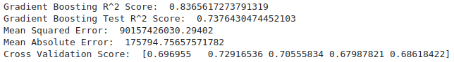
Gradient Boosting is the highest performing model amongst all used with the accuracy of 84% on the training dataset and 73% on the testing dataset. We use GridSearchCV for the hyperparameter tuning of our model parameters.
We can also check which are the important features in the dataset.
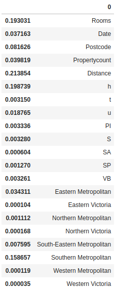
Distance, Room type ‘h’ and Rooms are the most important features which affect our Gradient Boosting model.

GridSearchCV found best parameters for Gradient Boosting with 77% training accuracy and 75% testing accuracy.
K nearest neighbors could be used for such problems as the price of surrounding places will mostly be responsible for the price.
Evaluating KNN shows that it’s clearly overfitting and the data is not suitable for such.

In conclusion, Gradient Boosting is the most accurate model with this dataset. We learned that Distance, Rooms, and Type of room are important factors price of the place. Also read – Gaining Insight into the Functionality of Deep Q-learning.